作为从事前端的人员,页面的布局是最基本的工作之一,那么简而言之工作中就会遇到各种各样的布局问题,自己总结下来,希望会有用。
1.margin常见问题——IE6下的双边距bug
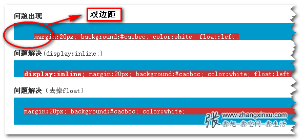
- 产生的条件是:margin + float + block元素
- 解决的原因:首先是inline元素或inline-block元素是不存在双边距问题的。然后,float:left等浮动属性可以让inline元素haslayout,会让inline元素表现得跟inline-block元素的特性一样,支持高宽,垂直margin和padding等,所以div class的所有样式可以用在这个display inline的元素上。
2.margin重叠问题
- 解释:垂直边距可能会发生重合
- 解决办法
3.margin在流动性布局中的使用
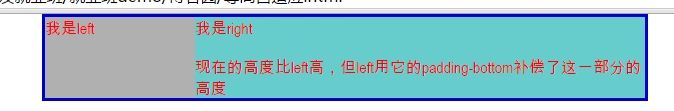
1.两栏不固定布局
- 左列用来导航,右列来显示内容,我们看到它们有一个共同的框,中间还有一条分隔线,左右两列高度都不固定的。
- 这种情况下需要两列的高度保持一致,否则会出现断层的效果
- 方案:padding补偿法
- 方法解释:把列的padding-bottom设为一个足够大的值,再把列的margin-bottom设为一个与前面的padding-bottom正值相抵消的负值,父容器设置超出隐藏。
1
2
3
4
5
6
7
8
9
10
11
12
13
14
15
16
17
18
19
20
21
22
23
24
25
26
27
28
29
30
31
32
33
34
35
36
37
38
39
40
41
42
43
44<head>
<meta charset="utf-8">
<style>
body{
padding: 0;
margin: 0;
color: #f00;
}
.container{
margin: 0 auto;
width: 600px;
border: 3px solid #00c;
/* 关键点,让超出的部分隐藏 */
overflow: hidden;
}
.left{
float: left;
width: 150px;
background: #B0B0B0;
/* 障眼法设置,看起来是等高的 */
padding-bottom: 2000px;
margin-bottom: -2000px;
}
.right{
float: left;
width: 450px;
background: #6cc;
padding-bottom: 2000px;
margin-bottom: -2000px;
}
</style>
</head>
<body>
<div class="container">
<div class="left">我是left</div>
<div class="right">
我是right
<br>
<br>
现在的高度比left高,但left用它的padding-bottom补偿了这一部分的高度
</div>
<div style="clear:both;"></div>
</div>
</body>
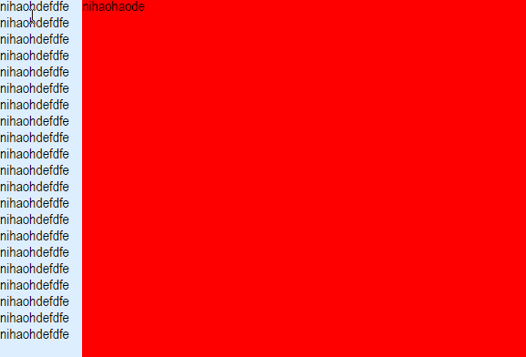
2.移动端两栏自适应布局
- 左边固定宽度,右边自适应宽度
1
2
3
4
5
6
7
8
9
10
11
12
13
14
15
16
17
18
19
20
21
22
23
24
25
26
27
28
29
30
31
32
33
34
35
36
37
38
39
40
41
42
43
44
45
46
47
48
49
50
51
52
53
54
55
56
57
58
59
60<head>
<meta charset="utf-8">
<meta name="viewport" content="width=device-width, user-scalable=no, initial-scale=1.0, maximum-scale=1.0, minimum-scale=1.0">
<style>
html,body{
height: 100%;
width: 100%;
}
body{
margin: 0;
padding: 0;
}
.main{
width: 100%;
height: 100%;
}
.left{
width: 90px;
height: 100%;
background-color: #def;
float: left;
}
.right{
height: 100%;
background: red;
overflow: hidden;
}
</style>
</head>
<body>
<div class="main">
<div class="left">
nihaohdefdfe
nihaohdefdfe
nihaohdefdfe
nihaohdefdfe
nihaohdefdfe
nihaohdefdfe
nihaohdefdfe
nihaohdefdfe
nihaohdefdfe
nihaohdefdfe
nihaohdefdfe
nihaohdefdfe
nihaohdefdfe
nihaohdefdfe
nihaohdefdfe
nihaohdefdfe
nihaohdefdfe
nihaohdefdfe
nihaohdefdfe
nihaohdefdfe
nihaohdefdfe
</div>
<div class="right">
nihaohaode
</div>
</div>
</body>
- 左边固定宽度,右边自适应宽度
3.宽度自适应
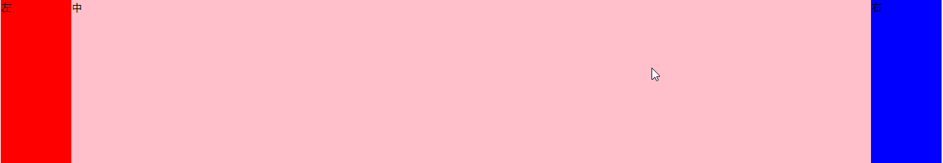
- 左 中 右
1
2
3
4
5
6
7
8
9
10
11
12
13
14
15
16
17
18
19
20
21
22
23
24
25
26
27
28
29
30
31<head>
<meta charset="UTF-8">
<title>Document</title>
<style>
.left{
float: left;
width: 100px;
_margin-right:-3px;/*兼容IE6下的3px的bug(使用float引起的)*/
height: 1000px;
background-color: red;
}
.right{
float: right;
width: 100px;
_margin-left:-3px;
height: 1000px;
background-color: blue;
}
.center{
margin:0 100px;
_margin:0 97px;
height: 1000px;
background-color: pink;
}
</style>
</head>
<body>
<div class="left">左</div>
<div class="right">右</div>
<div class="center">中</div>
</body>
- 左 中 右
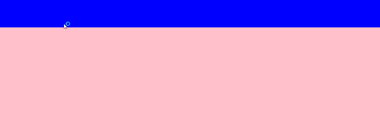
4.高度自适应
- 运用在后台界面中
- 上:高度固定菜单或者导航栏
- 下:高度自适应显示内容
- IE7+以及chrome,firefox中利用绝对定位可以,但IE6中并不使用,在IE6中给html设定padding值并不会撑大html尺寸
1
2
3
4
5
6
7
8
9
10
11
12
13
14
15
16
17
18
19
20
21
22
23
24
25
26
27
28
29
30
31
32
33
34
35
36
37
38
39
40
41
42
43
44
45
46
47
48
49<head>
<meta charset="UTF-8">
<title>Document</title>
<style>
html,body{
height: 100%;
}
body,div{
margin: 0;
padding: 0;
}
*html{
padding-top: 100px;
}
.top{
height: 100px;
width: 100%;
position: absolute;
top: 0;
background-color: blue;
}
.con{
height: 100%;
position: absolute;
width: 100%;
top: 100px;
bottom: 0;
overflow: auto;
background-color: pink;
}
/*for ie6*/
*html .top{
height: 100px;
width: 100%;
position: absolute;
top: 0;
background-color: blue;
}
*html .con{
position: static;
height: 100%;
background-color: pink;
}
</style>
</head>
<body>
<div class="top"></div>
<div class="con"></div>
</body>